Destination discovery
Introduce a lesser-known trail destination with enough atmosphere and context to create interest.
Designing and building an immersive event website that turns Mancherial’s landscape, race choices and climate-action purpose into one clear journey.
Explore the case study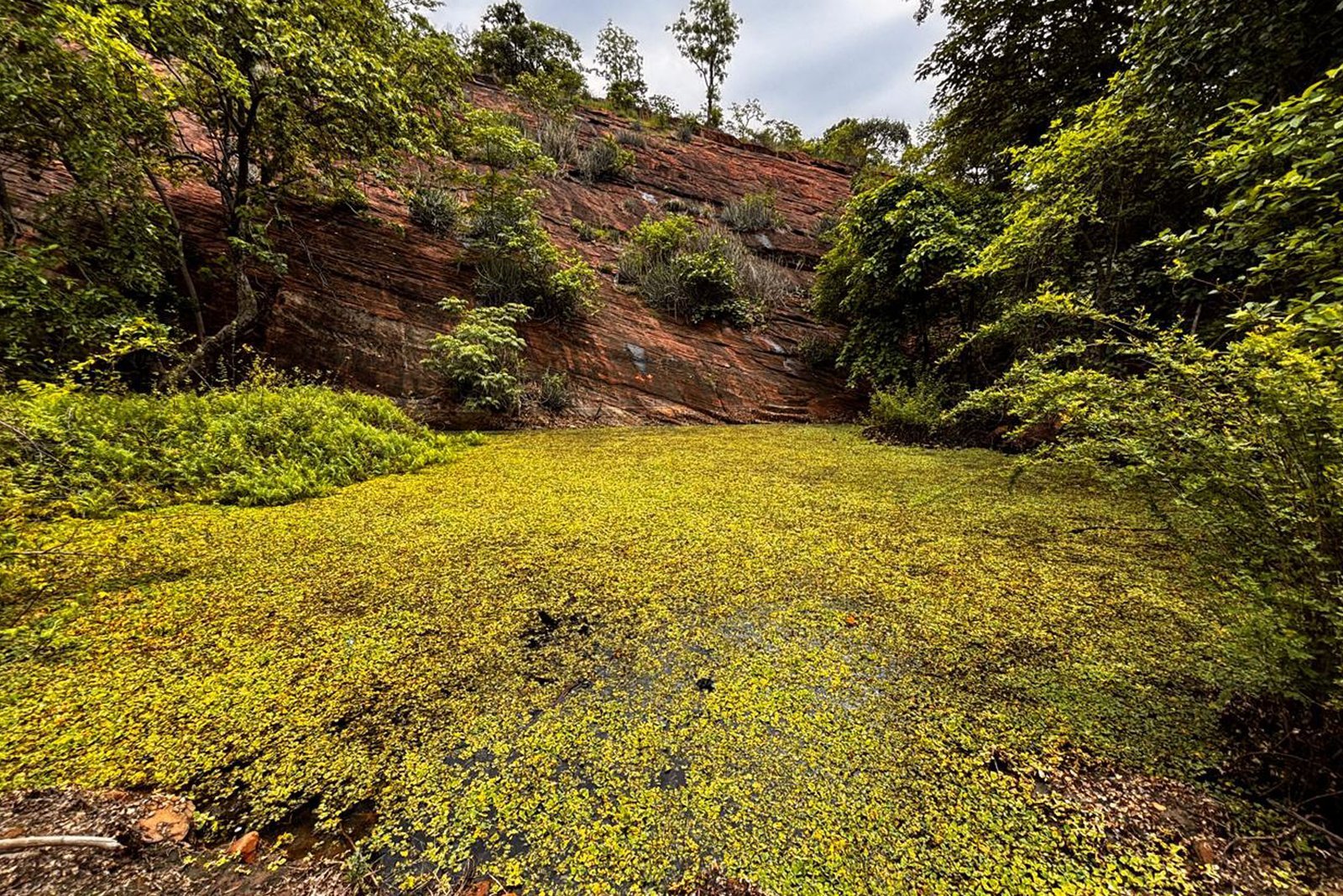
The website presents a scheduled trail-running experience with 5 km, 10 km and 30 km categories, destination guidance, course information, safety content and external registration.
VISIT GTRULTRA.COMThe experience had to inspire runners, establish Mancherial as a destination and still help visitors quickly understand routes, logistics, safety and the path to registration.
Introduce a lesser-known trail destination with enough atmosphere and context to create interest.
Make the 5 km, 10 km and 30 km choices easy to compare without reducing the sense of adventure.
Keep a clear route from discovery to registration across desktop and mobile journeys.
I shaped the experience architecture, visual language and responsive front-end implementation, bringing the event’s landscape, purpose and practical information into one coherent system.
Organised event, destination, course, travel, FAQ, safety and contact information into focused pages.
Combined forest colour, topographic details, editorial typography and immersive photography.
Implemented navigation, media, content components, motion and mobile behaviour for a cohesive experience.
Added semantic structure, social metadata, accessibility foundations and clear external registration links.
The design balances emotional storytelling with the certainty runners need before committing to an unfamiliar course and destination.
Landscape imagery and destination language establish Mancherial as part of the event’s value.
Distinct route categories help runners find an appropriate challenge without unnecessary complexity.
Registration remains prominent while supporting information stays available for deeper evaluation.
Responsive layouts, concise cards and clear navigation support visitors planning from a phone.
A simple route allows inspiration and practical decision-making to reinforce each other.
Encounter the landscape, event spirit and climate-action purpose.
Understand the destination and why it is worth the journey.
Compare 5 km, 10 km and 30 km experiences.
Review travel, FAQs, rules and safety information.
Continue to the external registration platform with clear intent.
Earthy greens, warm trail accents, topographic forms and expansive landscape photography create a distinctive event identity while maintaining strong readability.
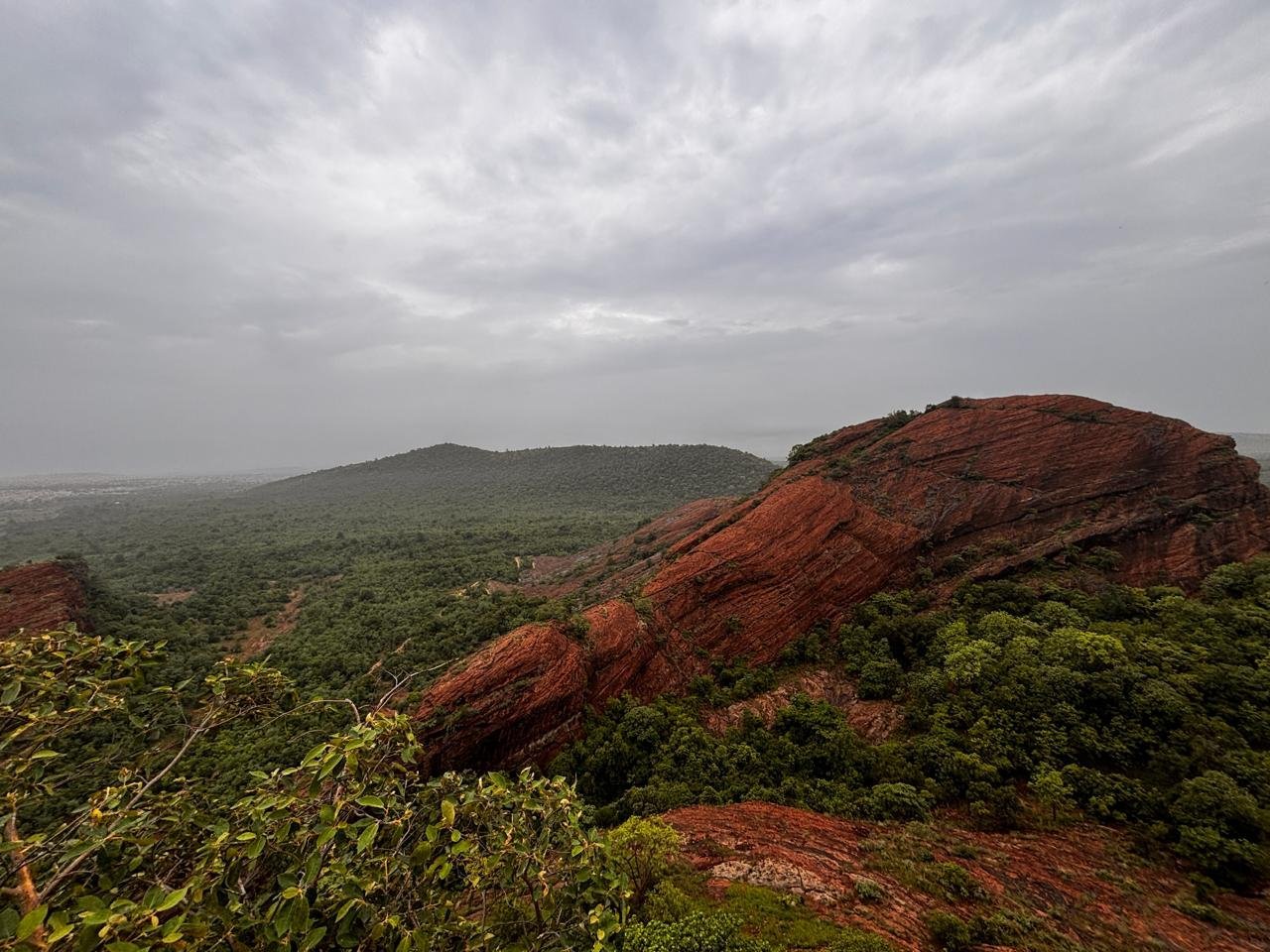
The live website brings event storytelling, route selection, destination planning and registration access together without relying on unverified performance claims.
A recognisable visual system gives the trail run its own digital character and destination story.
Dedicated pages make course, travel, FAQ, safety and contact content easier to navigate.
Clear registration calls-to-action remain available across the website and screen sizes.
The strongest event websites do more than announce a race. They help people imagine themselves at the start line.